Termas de Chaves - Brochure Design
Client
Services
Editorial Design
Credits
Project developed at LKCOM - Marketing of Tomorrow

Details
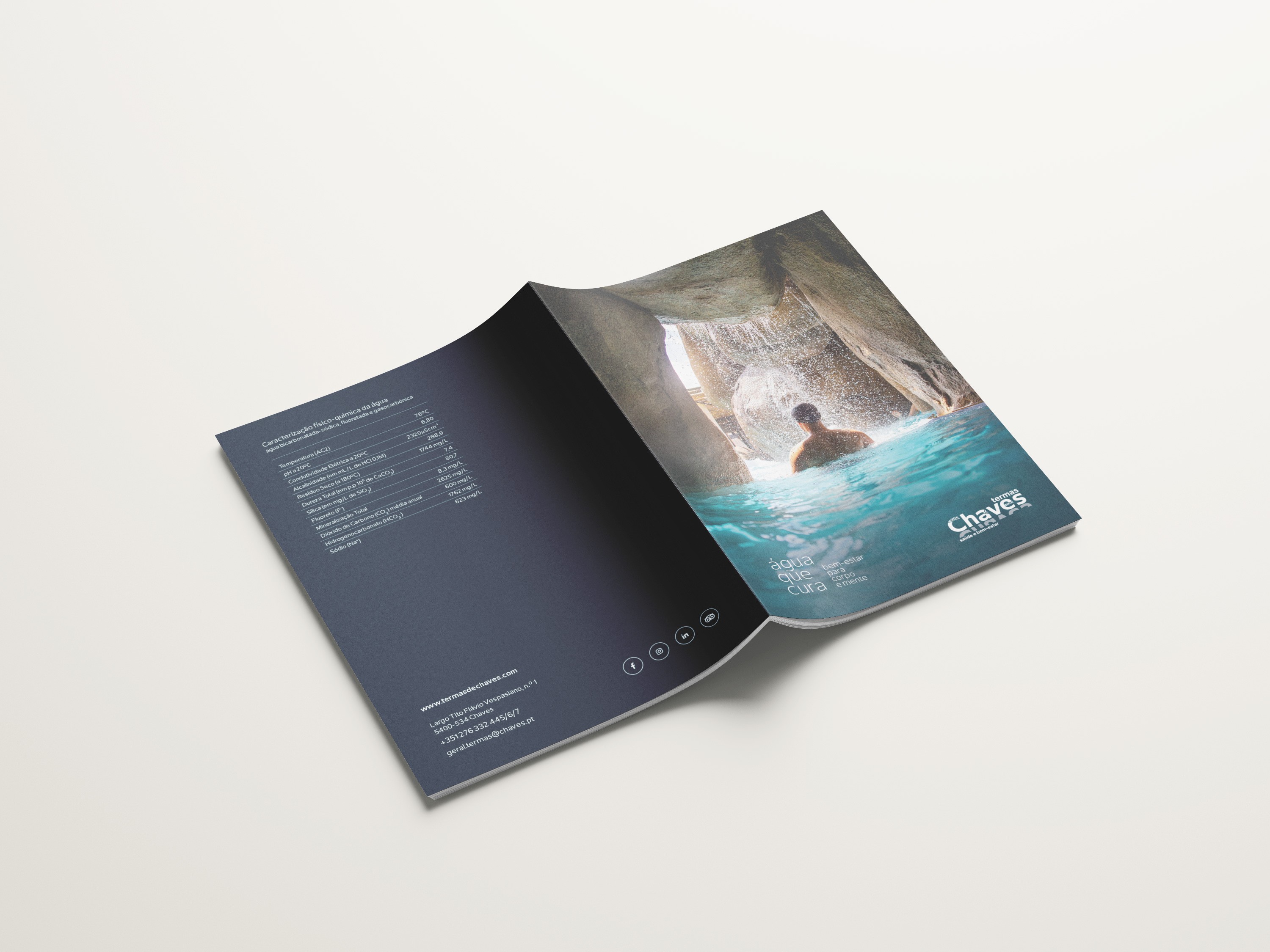
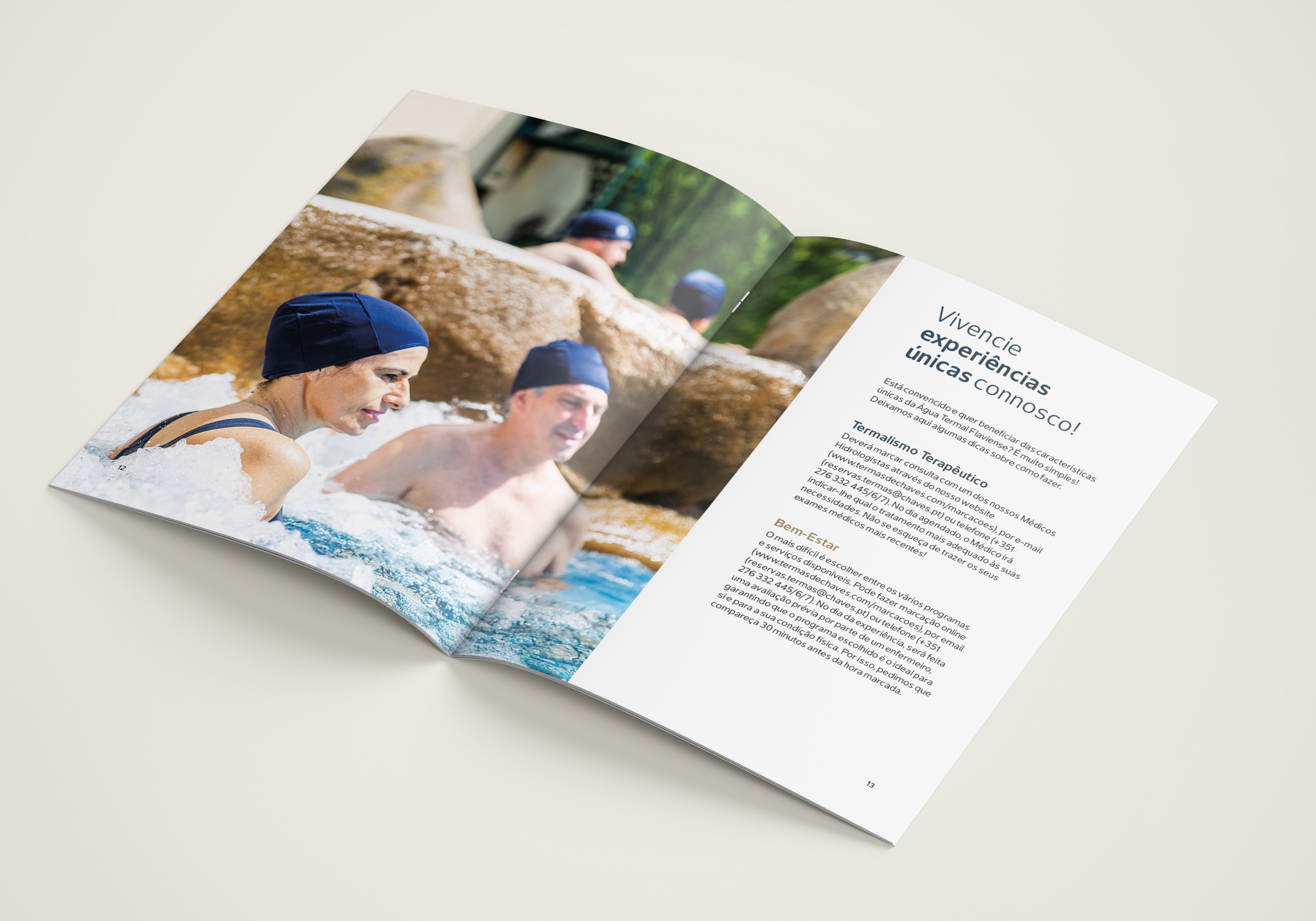
This brochure was developed for Termas de Chaves with the goal of presenting the brand’s treatments, experiences, and products in an accessible and inviting way. The focus was on translating the spa environment into a coherent, serene editorial piece that is easy to navigate.
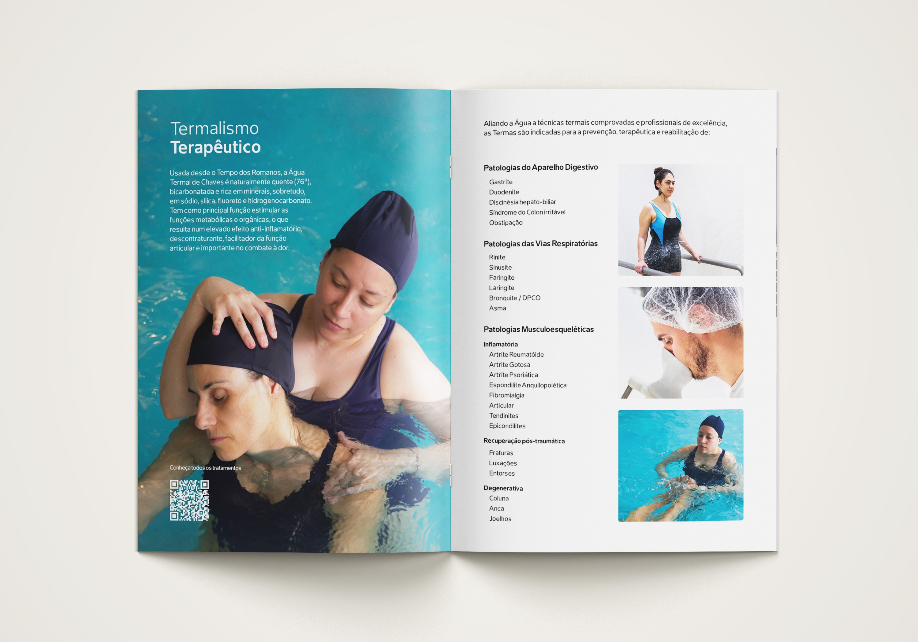
The visual language is based on the brand’s blue tones, reinforcing the connection to water and a sense of freshness. Careful use of negative space and generous margins adds lightness to the layout and improves readability. Gold, in line with the brand identity, is applied exclusively to the wellness treatment pages, highlighting these sections as special moments focused on self-care.
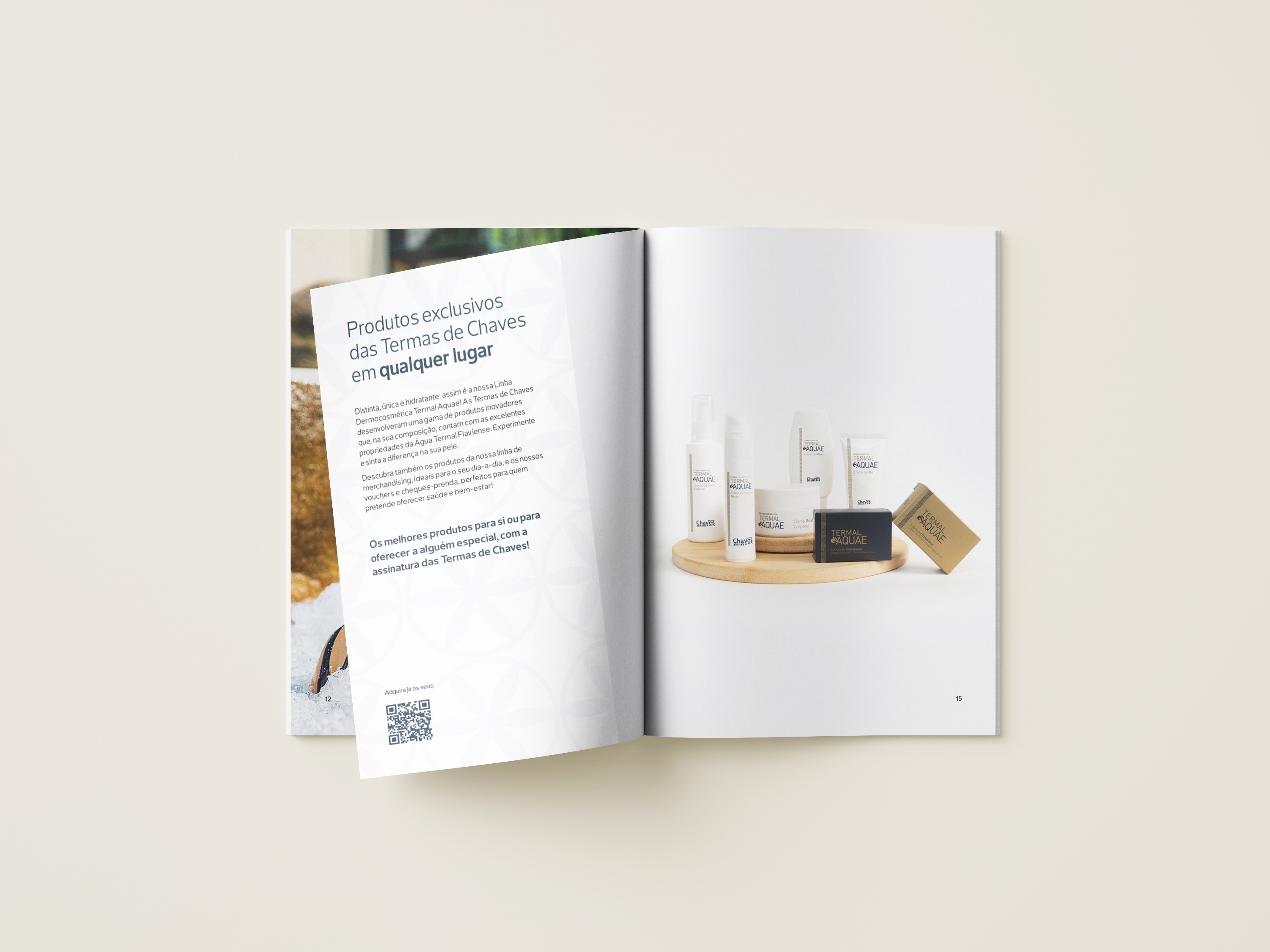
Some layouts also incorporate official brand patterns inspired by graphics and symbols from epigraphs, archaeological pieces, and monuments of Chaves, serving as identity extensions. The typography used is the brand’s official typeface, ensuring consistency across the visual universe and comfortable reading throughout the brochure.