Noshut
Client
Year
2026
Services
Identity Design
Credits
LKCOM - Marketing of Tomorrow
Details
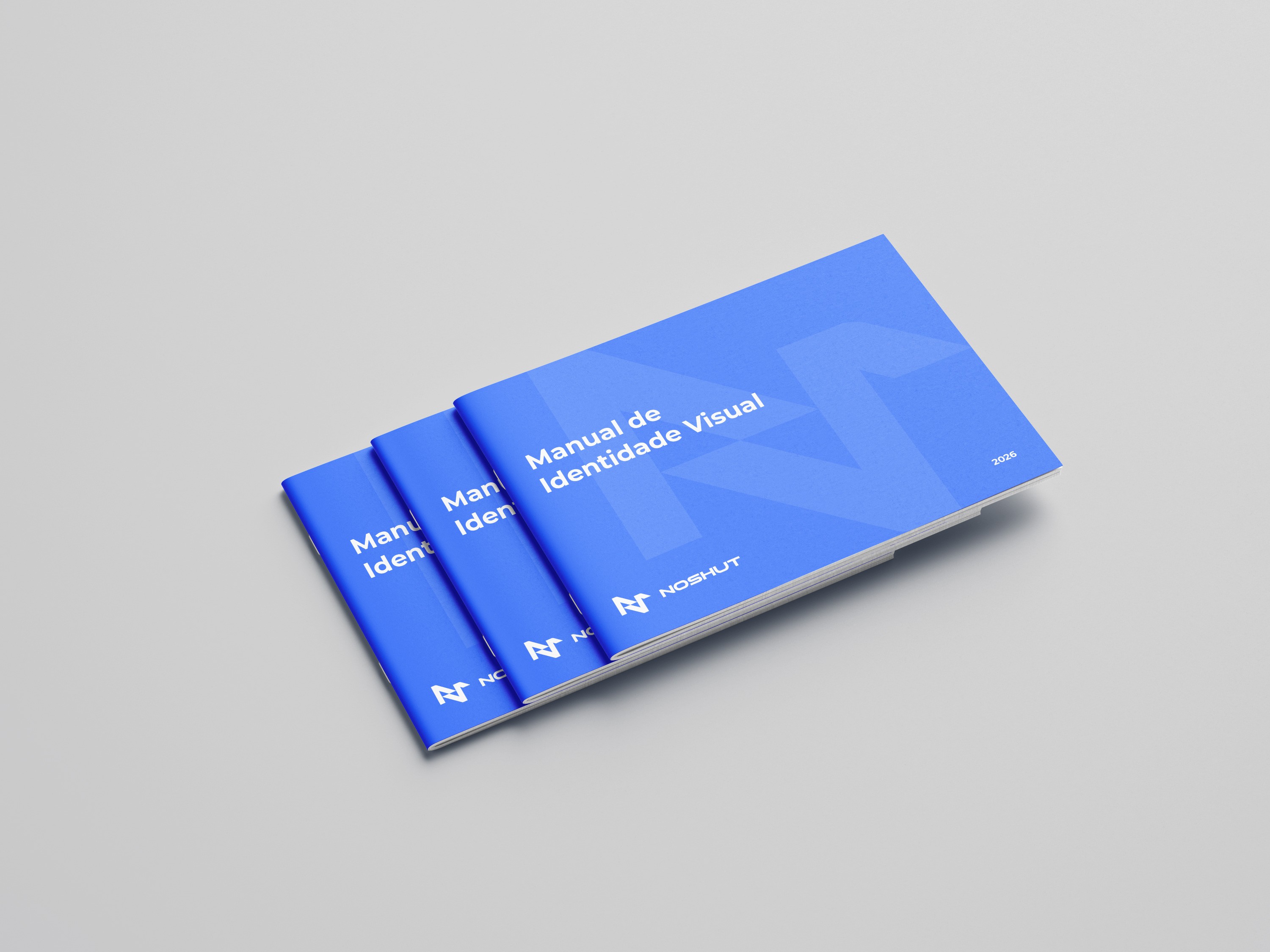
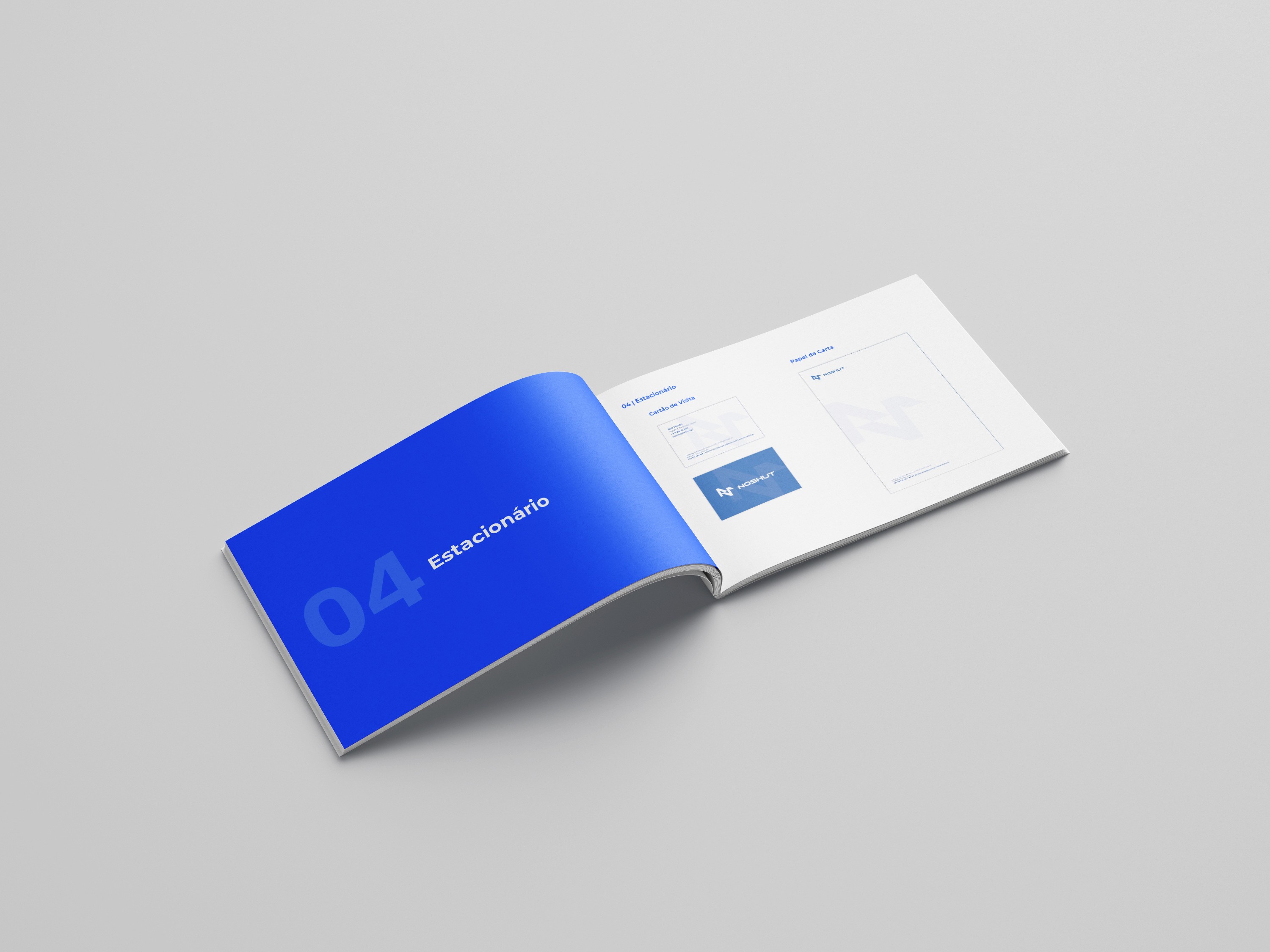
The rebranding of NOSHUT was developed to reinforce the company's position as a modern technology partner, specialising in networking, cybersecurity, telecommunications and digital transformation solutions.
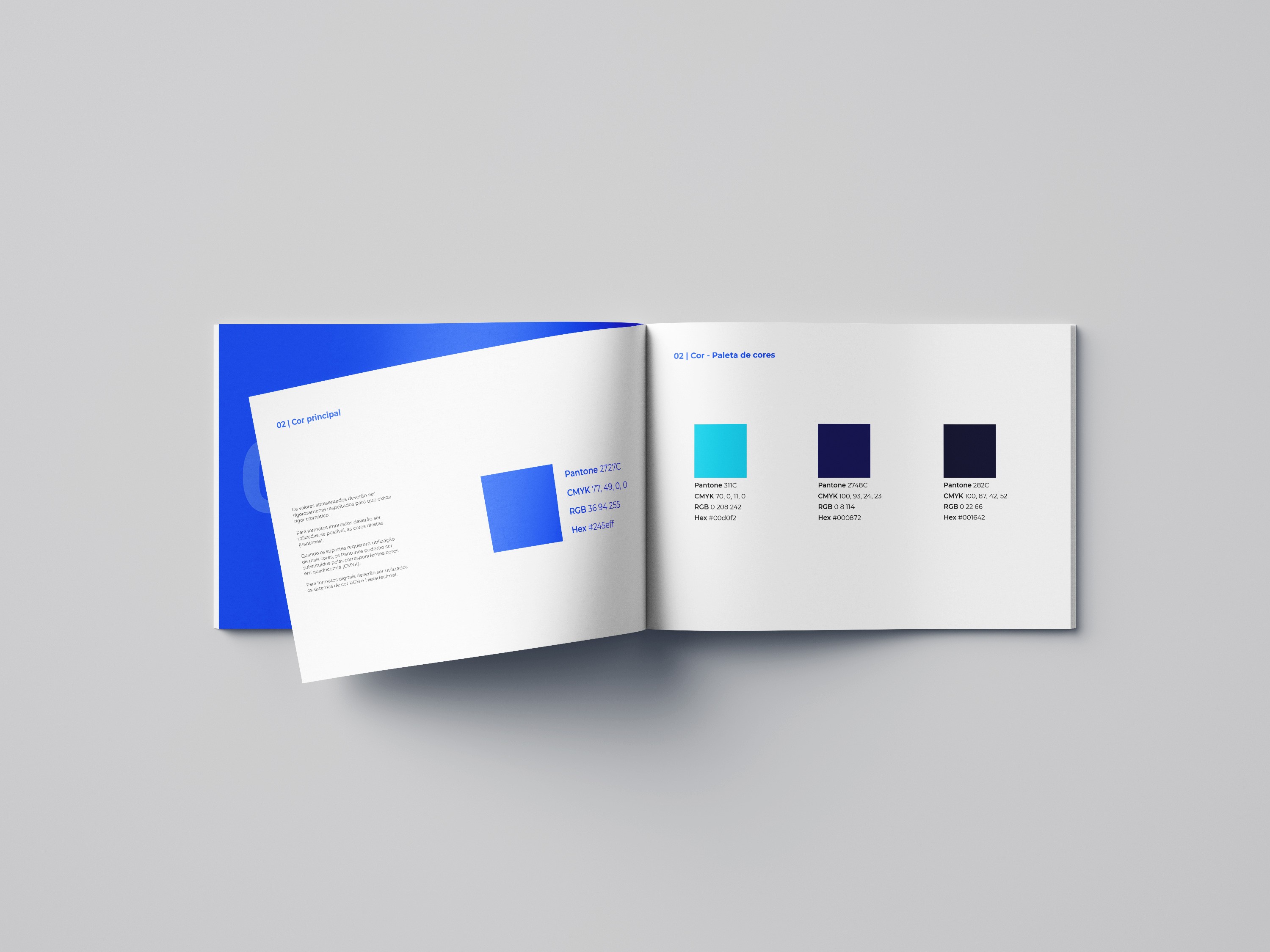
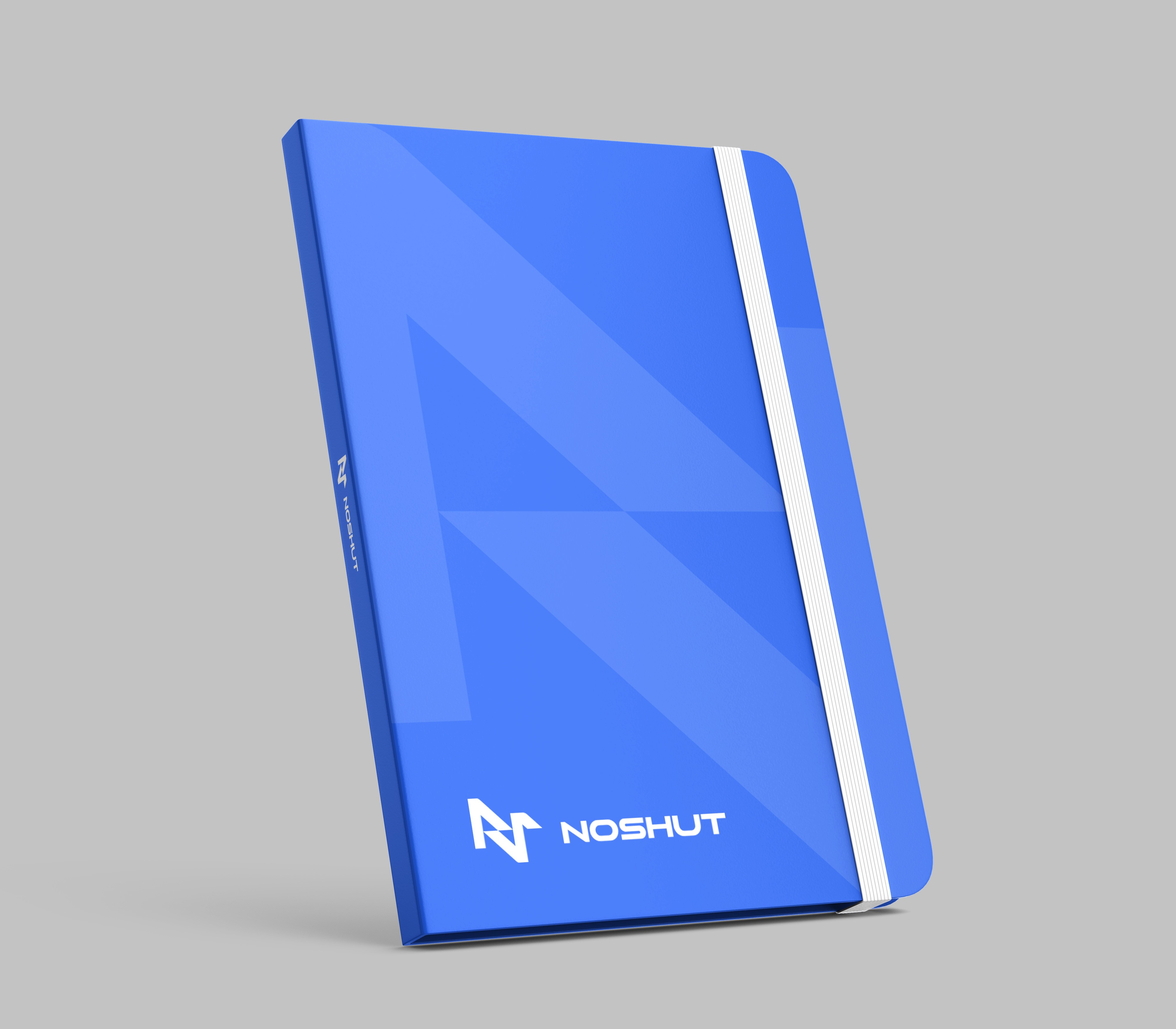
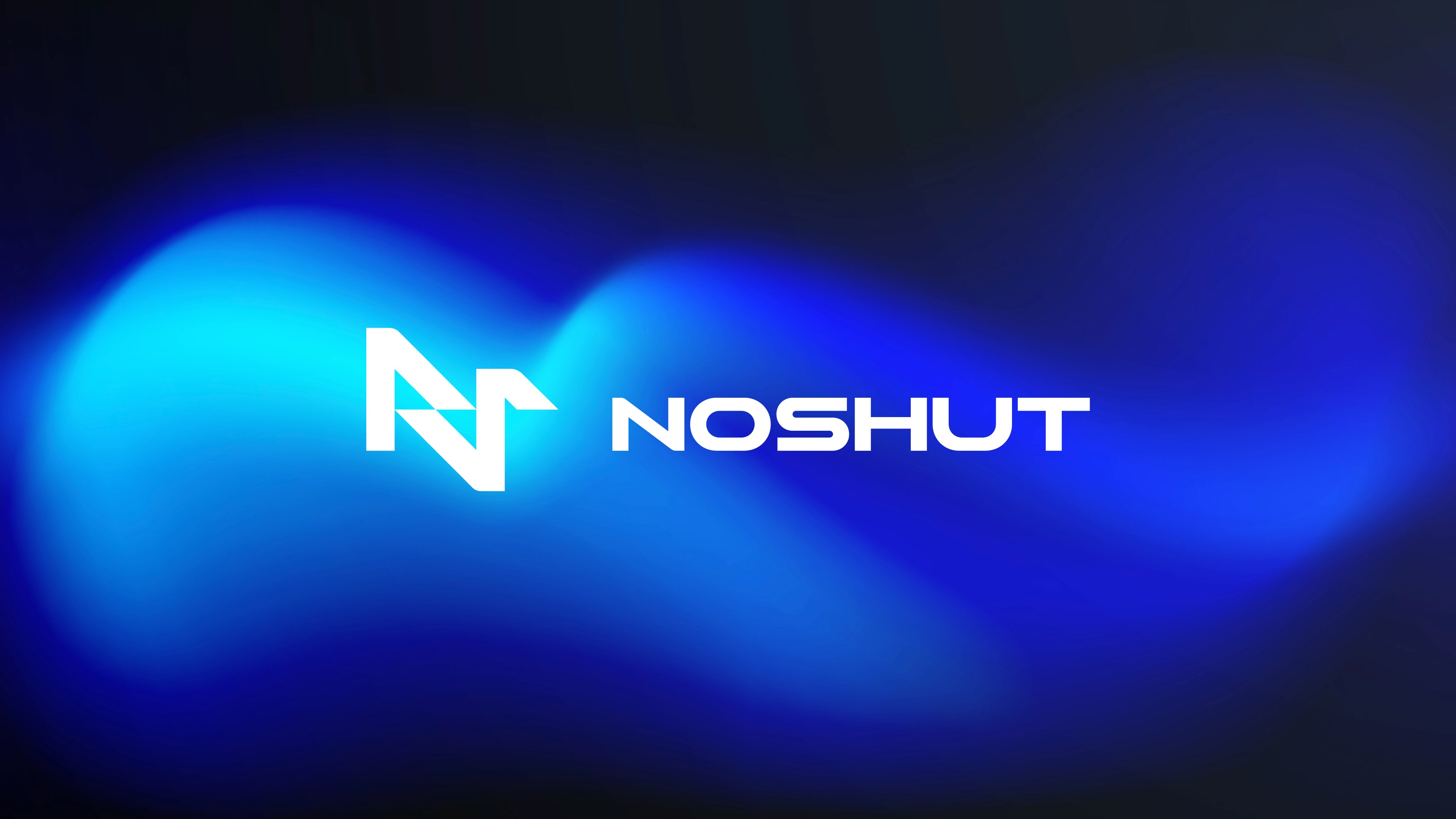
The visual identity was redesigned with a strong focus on innovation and technology. An electric blue colour palette was selected to represent connectivity, digital evolution and the dynamic nature of the industry, while also providing a solid foundation for future digital applications and products.
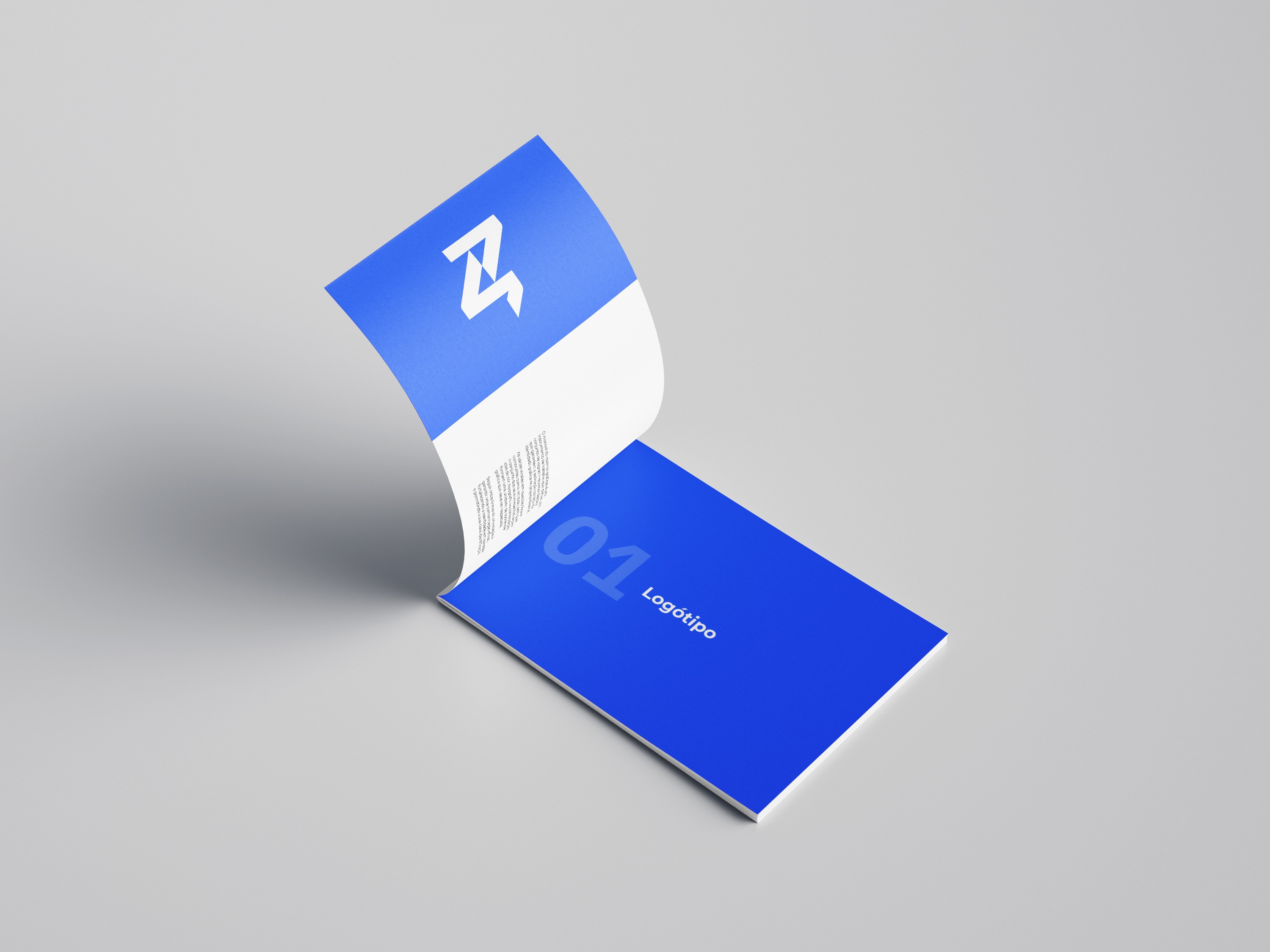
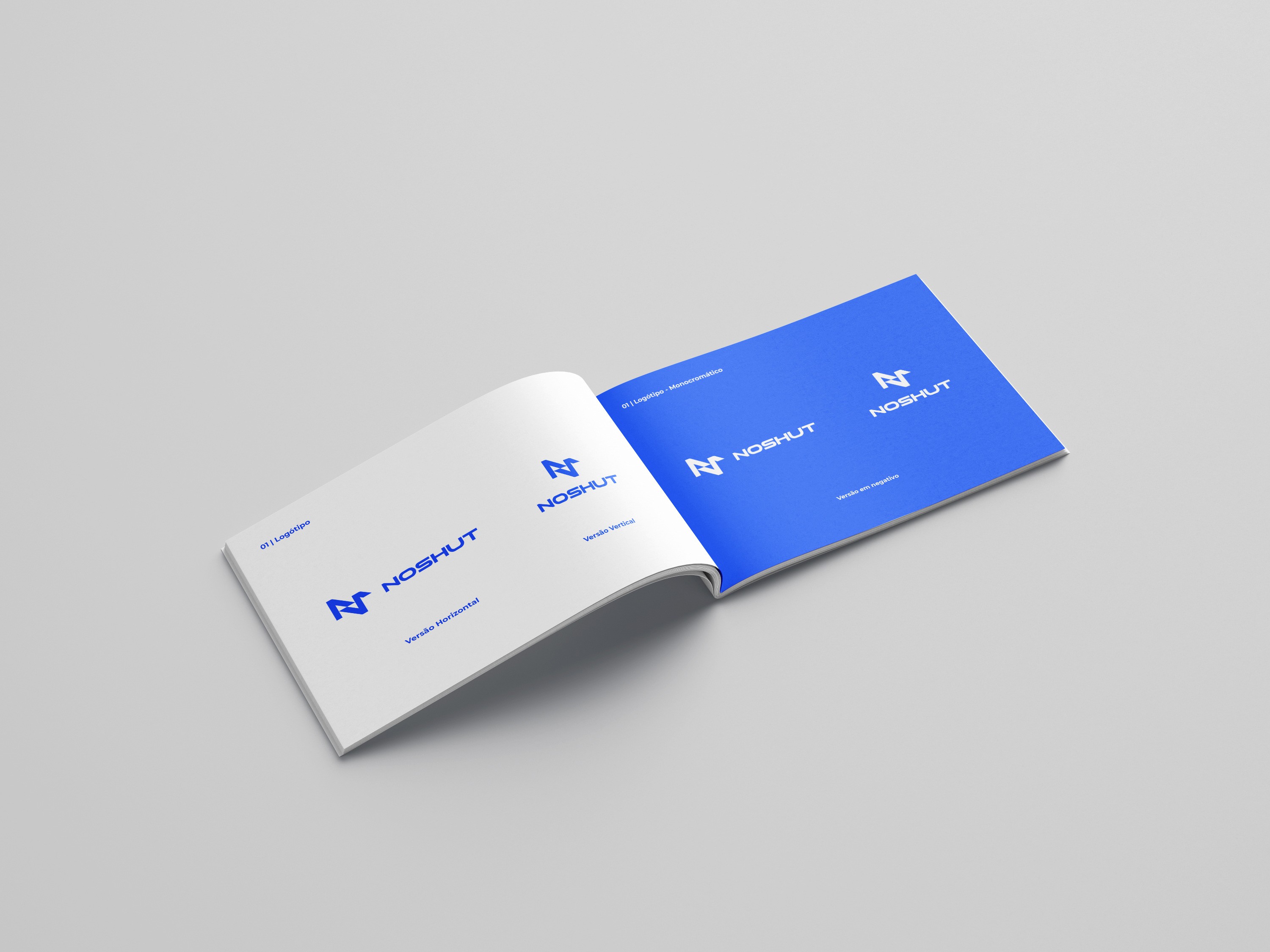
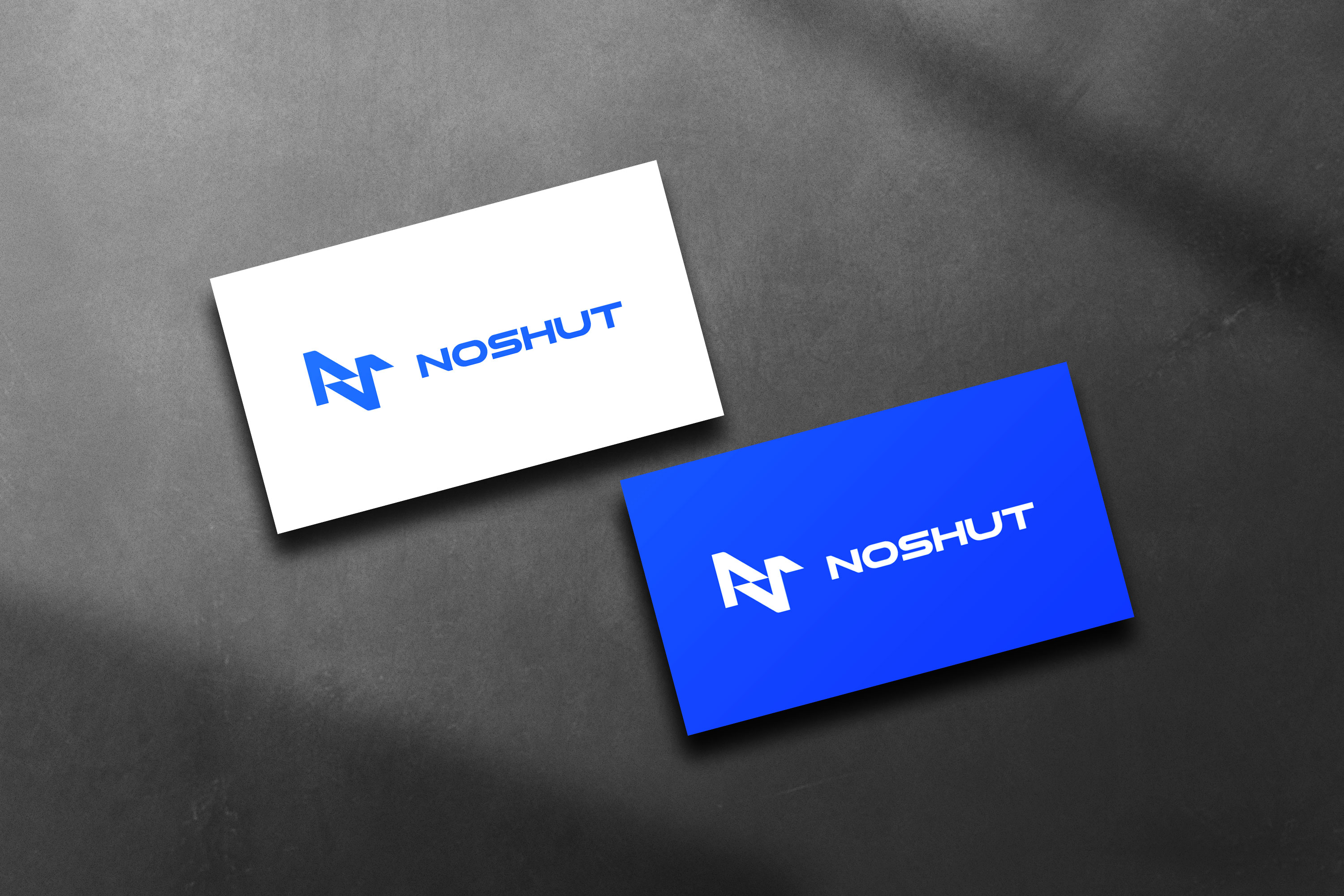
The symbol was designed from a geometric interpretation of the brand initials, creating a distinctive and memorable mark. Its interconnected forms convey movement, integration and communication, reflecting the technological ecosystem in which NOSHUT operates. The custom logomark is paired with a modern, futuristic typeface that strengthens the brand's innovative and forward-thinking character.
Alongside the rebranding project, a comprehensive colour system was developed to ensure consistency across future brand touchpoints and digital products. The new identity is currently being extended into a fully redesigned corporate website, which is being designed by me, creating a cohesive digital experience aligned with the company's vision, services and future growth.